Fix Your Overflows
by hikosan (15-May-2026)
I've been trying to read an article on my phone, and upon scrolling down, the page drifted to the right, pushing all the content to the left, beyond the screen. I tried to readjust and control my scrolling, but the result was the same. I tried to do this "zoom out" gesture (whatever it's called) with my fingers, but the webpage became so small I couldn't read the text. Let me tell you: this is a truly annoying experience. I am sitting here, wondering, "Why can't you simply fix your overflows?". Come on, it can't be that hard. Don't you browse your own webpage on phone and see that's not it? That there's an issue?
Now when I see the horizontal scroll bar appear on the bottom, I automatically try to see how small the page will get if I zoom out. Well, sometimes it's not that horrible, but it drives the perfectionist inside of me a little bit nuts when, for example, seeing the header getting a strong cutoff on the right. The web is so broken, and not because of the standards or the technology--no, it's because I came to the realization that people do not like CSS. People do not like to manually type out HTML tags with CSS rules, and then debug that using web browser's devtools. But it's not that complicated, bear with me! Because I am going to fix your overflows (*of random websites I stumbled upon as of today--the day of writing this article) and show how it's not that complicated and only takes a few minutes of your time.
But, before we begin, let's understand why the overflow happens: that's usually because one of the elements has an incorrect size (width value) that makes it ignore the parent element's size and push beyond it. So, say, you have a div element that has a size of width=200px, which has a child element that is of size width=300px--this will cause the so-called overflow. Other common causes are code blocks and negative margin values. This happens because of incorrect styling (wrong CSS rules). The good news is that there's a way to debug it using "Developer Tools" (which you can invoke by pressing F12 in web browser):
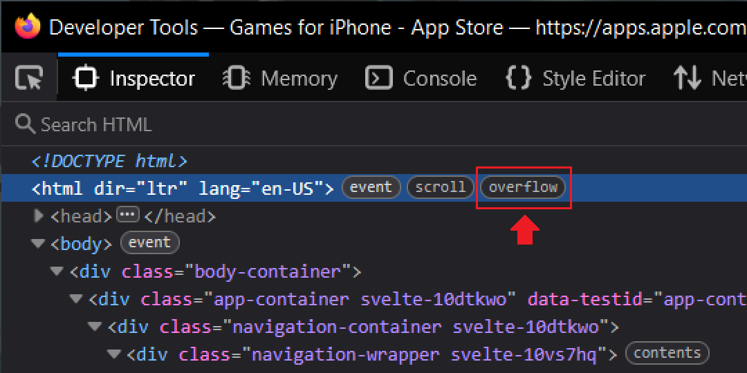
The most common reason for this is usually because there is an element somewhere that has a fixed width that does not change when the web browser's window gets resized. In CSS, there are few ways to declare the width of an element: width (fixed), max-width / min-width (dynamic). For example, look at the animation below that shows how the navigation bar does not fit within the header and stretches beyond:

If we look at the DOM, we will see how old-fashioned the HTML is: that navigation bar was implemented using a table, and each ul element has a fixed width defined in CSS as width: 120px. This website is clearly not mobile friendly, because hovering over each link in the navbar will show more links. This would require rewriting the navbar entirely, accounting for smaller screens.

This another example defines both min-width and max-width properties with the same value 80ch. That makes it essentially equivalent to defining the width property. And since it is being used on the body element, it prevents all the content within it to adapt to smaller screen resolutions. The good thing is that the fix here does not require rewriting any HTML.
First of all, let's remove the min-width property from the body element. This will allow for everything within the body element to adapt to its size (as long as they don't have fixed width). Then we will give it padding: 20px to add some spacing on the sides. The horizontal bar does not disappear, though. Another obvious thing that can cause this is the pre element which is usually used for code blocks. It has one at the bottom of the page, so it needs to have some style fixing. The pre element has a child element code which has a fixed width:
Obviously, you should fix it in the actual CSS file--anything you're doing in DevTools is debug-only / for viewing the changes in real-time, and updating the page will reset every change made. This fixes everything, the overflow is no more. But it might introduce a new problem: what if the code inside of the code block is actually long, and it doesn't break to the new line? There's actually a known best practice for such elements--the content should be contained within that element using a horizontal scrollbar. You can learn to do that (or steal mine). The last thing, your header will look messy, so you want to make sure that once the screen is small, you want to add this code:
@media only screen and (max-width:600px) { nav { flex-direction: column; gap: 14px; } }

Having learned the basics, and the most common causes of this annoying "bug", let's cure some patients.
NOTE: just to be safe, take this as an advice and not an actual solution.
Next patient can be fixed with a single max-width property that needs to be applied to an element with a very weird class name (do people nowadays really prefer this over clean and short CSS names?):

.max-w-\(--breakpoint-lg\).mx-auto.mb-32.mt-16.w-screen.px-4.lg\:mt-20 { max-width: 100% }
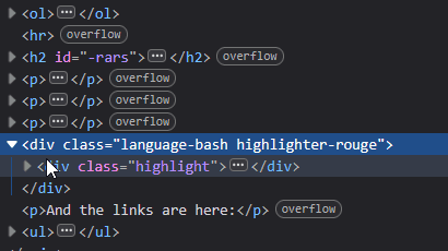
Moving on, the next broken website happens to be the infamous AOSA book. Firing up devtools and the body element shows an overflow indicator, but that particular element has no issues as it uses max-width, so its width is not fixed. Could it be a code block? Indeed! It has a huge block of code inside of the classic pre element. We can fix this with simple:
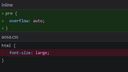
pre { overflow: auto }
Hold on, the overflow remains. Interestingly enough, the html element has a property font-size that is set to large. This is another reason why an overflow would happen, so to fix this you have to simply remove that rule. And if you want larger text--specify font-size for specific elements.
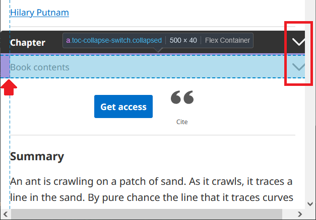
The overflow on this page is caused by the two drop-down menu blocks that have a margin with a negative value and a fixed width. To fix this, we will change width to max-width and remove the margin rule. So, in styles.83ea522.css:
- Step 1: in #app-tabs.mobile .tabs__collapse[data-v-1d90c6ce], #app-tabs.tabs .tabs__collapse[data-v-1d90c6ce], change margin: 0 -15px to margin: 0
- Step 2: in @media (max-width: 640.98px) {#app-tabs.mobile .tabs__wrapper .container[data-v-1d90c6ce], #app-tabs.tabs .tabs__wrapper .container[data-v-1d90c6ce]}, change width: 100vw to max-width: 100vw, and margin: 0 -15px to margin: 0
- Step 3: in .table-of-content-mobile, change width: 100vw to max-width: 100vw, and margin-left: -15px to margin: 0

Ah, the Daring Fireball. The issue here is it being a classic old web relic. This one would require the use of adaptive styling. This shouldn't be an issue, because looking at the stylesheet, we can see it's using modern CSS features. So, what's up? What's the reason we don't make this small-screen-friendly?
Alright, I will propose a style fix. I have good news for John: this is absolutely possible with a single line that can be copy-pasted without breaking anything. The next needs to be pasted at the bottom of the stylesheet.
@media only screen and (max-width:785px){body{min-width:0;padding:20px;font-size:14px}#Box{width:100%;max-width:720px}#Main{margin:0 auto;width:100%;max-width:425px}#Sidebar{margin:0 auto !important;position:unset;width:100%;text-align:center}#Sidebar p{margin:0 auto;padding:0;font-size:12px}#Sidebar ul{line-height:24px;padding:0;margin:50px auto;font-size:12px}#Banner{margin:0 auto;width:100%;text-align:center}}
One more thing for this to work--in HTML you have to add this line inside of the head element, e.g. below the title:
<meta name="viewport" content="width=device-width, initial-scale=1.0">
This is necessary for the responsive layout to function on phone screens. And it's fixed.

This one can serve as a good example of why it is a bad idea to hide the problems. The html and body elements have the overflow-x property set to hidden--this basically hides the horizontal scrollbar. Here's solution for the main page (not docs, because it is already responsive):
- Step 1: in body, html remove overflow-x: hidden
- Step 2: in body, html replace max-width: 100vw with max-width: 700px
- Step 3: in body, html add margin: 0 auto
- Step 4: in .css-8zg6q6 remove width: var(--chakra-sizes-2xl);
- Step 5: in .css-1fu0utb remove width: var(--chakra-sizes-2xl);
- Bonus: in .css-1fu0utb add flex-direction: column; and gap: 20px;

Straight to the solution:
- Step 1: in .site-header, main, .archive-footer remove padding: 0 18px;
- Step 2: in body add padding: 20px;

The overflow is caused by the table element. The solution is similar to the code blocks--you have to create a parent wrapper element, and define the overflow-x property. You must be able to horizontally scroll within the table, instead of it pushing beyond the body's max width.

Fix: in @media (max-width: 800px) { body > main {...} } remove padding

Fix: add * { box-sizing: border-box } at the top of style.css

Fix: in just-the-docs.css, in .page-content a remove white-space: nowrap;
OK, I am done with free labor. I hope this was enough for you to understand the problem and the possible ways to fix it!